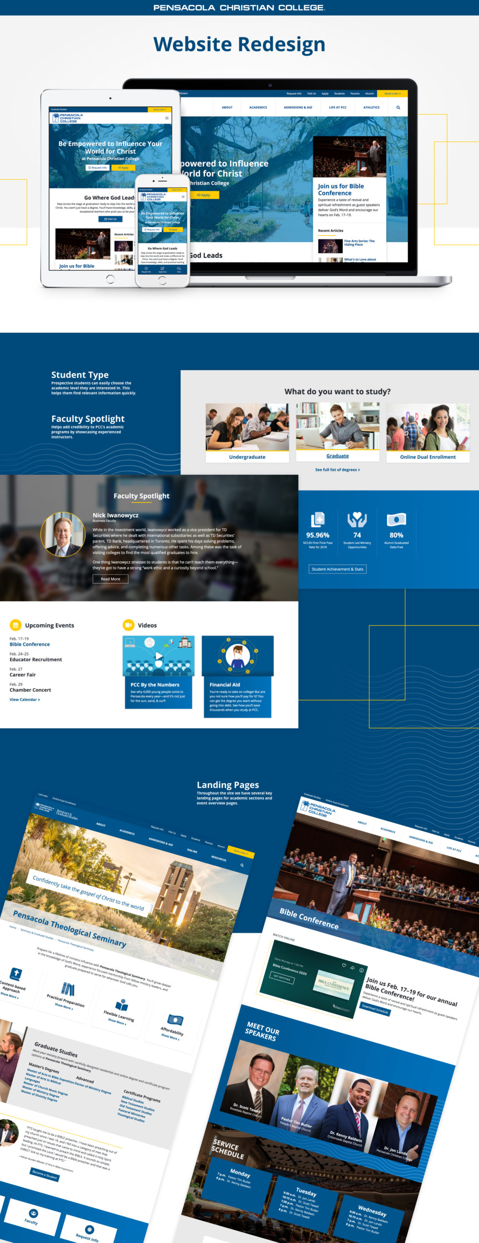
Check out the fully redesigned website!
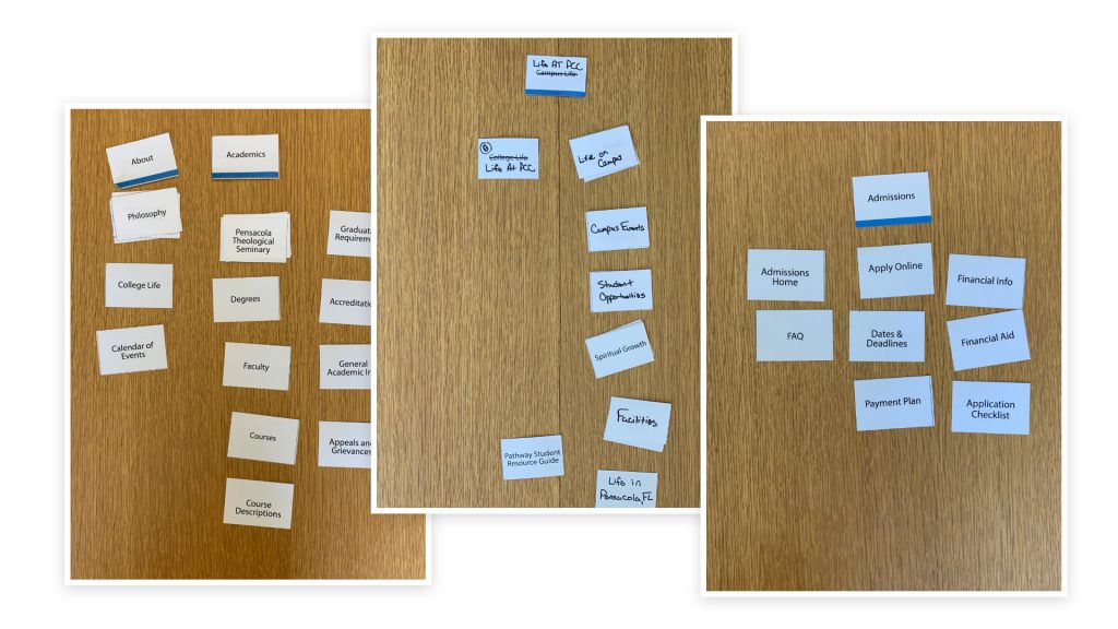
With the site redesign for 2020, I focused on simplifying the user experience for prospective students. Whether it was to find info about classes, campus life, or the application process, I worked on creating a site that was easy to navigate. After testing the site with high schoolers, college students, and faculty, I was confident our changes have helped make the site more user-friendly.
The website has been designed and developed with modern design and technology practices. I also created a design system to allow for easier collaboration and efficiency among the designers working on the project.
With over 50% of our users using mobile devices, I wanted to make sure users were able to navigate the site quickly without depending on fast internet speeds. Once we launched, we saw pages loading 32% faster after our initial testing. We started using Google Tag Manager with this redesign. Instead of just using Google Analytics I wanted to be able to easily collect more data on what our users were doing and how they are navigating the site. GTM easily helped us accomplish this.
Overall, the site is more standard to what prospective students would find when visiting top tier university websites. I am looking forward to seeing how well this site will perform with its users.
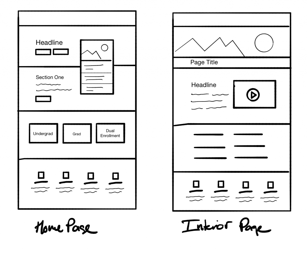
Check out some of the landing pages & other images of the redesign process (wireframe, card sort, mockups) below, or feel free to visit the new website.


