As a response to COVID-19 the Administration at PCC wanted to create an initiative to help students for the upcoming semester. Our Advertising team was presented with a brief explanation of directives for the initiative and we were asked to create a documented plan in less than a week.
So, we got to work brainstorming ideas of how we would present the information via the website, emails, and social media. Our marketing coordinator worked on a launch plan while our writer started organizing the info that we received from the Administration. My job was to start wireframing and figuring out the best way to structure all this content on the website.
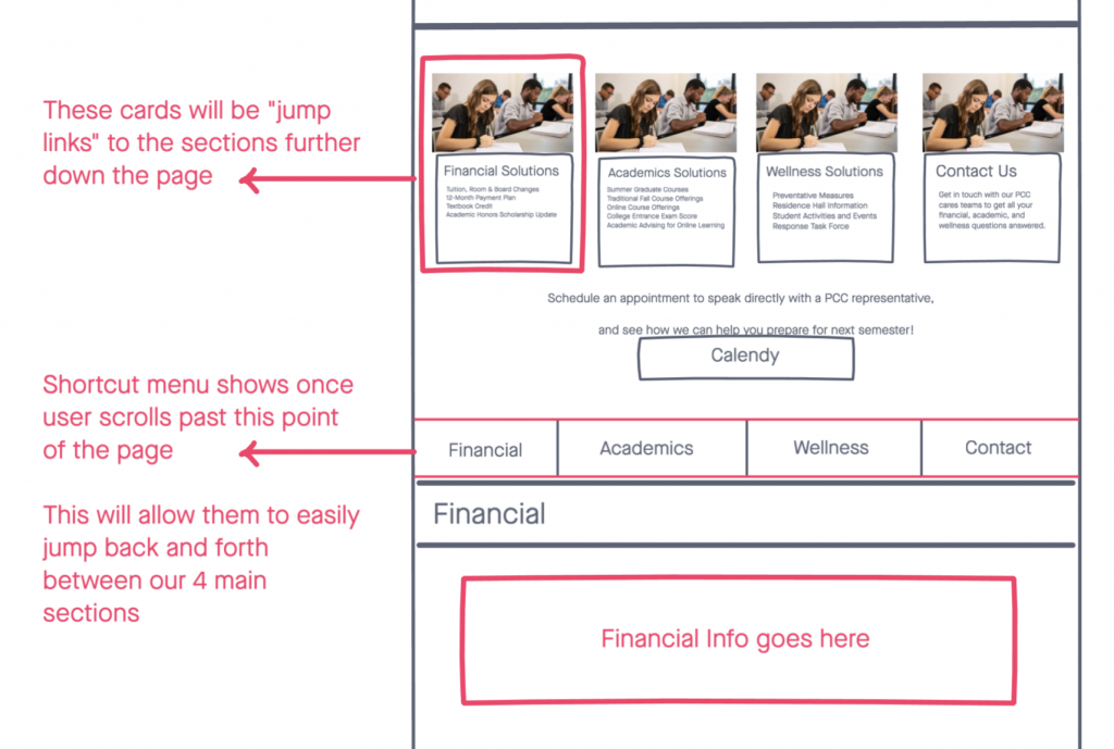
The initial thought was to have one page that briefly mentioned each section we wanted to present solutions for (Financial, Academic, and Health), then we would link the user to a separate page for each of those sections. After some research and prototyping, I presented the idea to have one page with all the info for the whole initiative. Then the user would not have to jump back and forth between several pages.
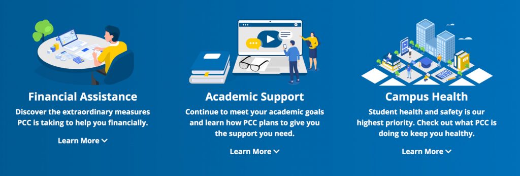
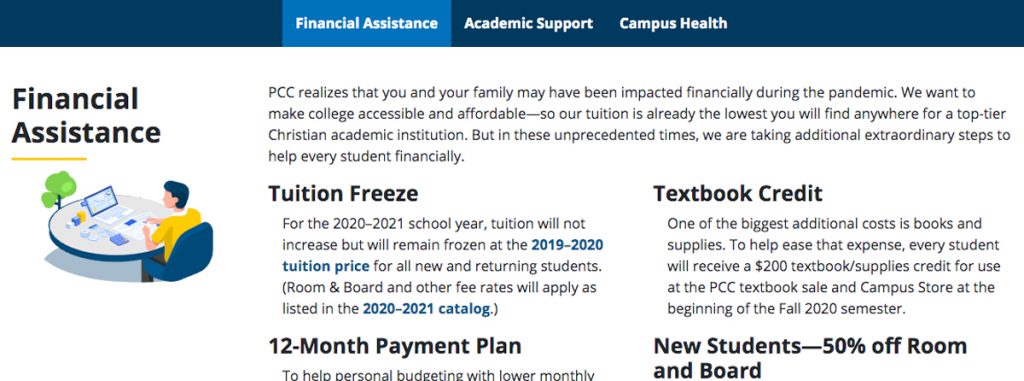
Now, that did present one glaring issue. Who wants to look and read a very long web page? To make the page easy to navigate I added navigational “jump links” that would jump the user to any of the three main sections.
After the wireframes were finished I started developing the pages right away. We wanted to make the page and the whole initiate come across in a very positive way. In the midst of uncertainty, we wanted to make sure our customers (current & future college students) knew that we had a plan and we were excited to help them meet their academic goals.
Launching the initiative has a huge success. The information was easy to digest and was user friendly across all computers and mobile devices.
Check out the images below to view the initial wireframes. Also, check out the website! pcci.edu/pcccares/


